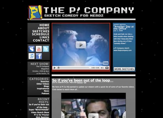
Good news, everyone! This week marks the launch of the new website I made for the P! Company, a sketch comedy group from Austin, Texas.
Their previous site ran on WordPress, like this one, so I jumped at the opportunity to make a new theme for them that could meet their demands, while allowing me to expand my skills with the platform and add to my portfolio.
The top priority for their new site was the video box on the main page; they wanted their latest sketch shoved down the throat of their visitors. With some help from planetOzh’s Theme Toolkit, I put together a YouTube embed box that can be easily changed from the admin panel.
Design wise, they wanted to keep the primary color scheme from their P! logo and the old-school space background. Too much red/blue/yellow can be overwhelming, so I used different shades of gray to offset it. Then, I used pixels as stars in the background (instead of stock space images from the web’s early days) to blend in with the blocky theme and maintain the nostalgic feel they were going for, hopefully without having it look too cliche.
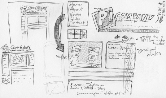
Here’s some one-of-a-kind original idea doodles from before I started photoshopping:
So that’s it. http://thepcompany.com/. Have a gander. Not too shabby.
Could you be my next gig?! It is entirely possible! Contact me!


One Response to The P! Company