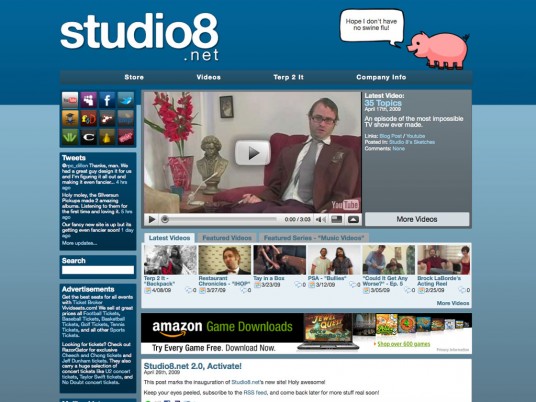
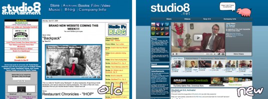
After a couple months of work and a last minute (but much needed) hosting switch, my latest project has been unleashed upon the internet. Say hello to Studio8.net’s brand new, WordPress-powered site: http://www.studio8.net/
Studio8.net is a sketch comedy group from LA and Austin and are friends with my friends in the Beeftrain Incident. They’ve worked with a whole bunch of companies and have a pretty solid following, but their old site, while packed to the brim with content, probably wasn’t as cohesive and 2.0 as it could have been.
Styling
 Some of the layout was committee designed, so I’m not 100% in love with all of it, but overall I think it’s pretty good.
All elements have subtle gradients, and the widgets and post boxes have CSS3 rounded corners. If you can tell, the eight-legged “pigtopus” in the top right is a Tommy drawing.
Video Integration
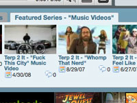
The front page features an embed and info of the most recently posted video. Below that, a tabbed box holds a table of the most recent videos posted after the aforementioned, a table of the featured videos from the group’s “Best Of” category, and a table of videos from the featured series, which can be easily switched through the control panel. The video’s thumbnails are automatically pulled from YouTube’s directories and are cropped with CSS.
 Instead of displaying all posts from all subcategories mixed together and sorted by date, the video category listing organizes the videos by alphabetical subcategory in tables, useful for series grouping. Like the video boxes on the front page, each thumbnail uses a custom, jQuery-powered tooltip to display an excerpt of the video’s description with its tags (if any), categories, and direct link to its YouTube page.
Single post pages in the video category or any of its subcategories display a widescreen embed of the video as well as the full content of the post (not the excerpt) and a link to the YouTube page. All of this is done using WordPress’s custom fields feature; the user does not have to manually embed the video into the post.
Theme Toolkit
 Using the wonderful planetOzh’s Theme Toolkit, the pigtopus speech text at the top can be changed, as well as the top navigation bar links, the front page featured series, the footer text and ad code, and the mid-page banner ad code. The less the you have to muddle around in the theme files, the better.
Speaking of ads, the mid-page banner is coded to display after the video boxes on the front page and after the first post in archives and listings, a common ad placement strategy for blogs.
Widgets
 Along with being widget ready, the theme comes with two widgets for upcoming events and social networking built in. Both are not hardcoded into the sidebar and can be placed and arranged alongside the default widgets.
The upcoming events widget queries the “Upcoming Events” category for posts dated in the future and displays their content with a tooltip. If there are no posts to display, the widget doesn’t show.
 The social networking widget features custom-designed buttons for all of the group’s accounts across the internet. It uses CSS sprites to save space and allow for easy rollover highlights; the entire thing uses just one image. Wowza!
Yay!
This site works in all major browsers, with some style hacks and dumbing down for old IE6 (which, of course, was impossible to make completely compliant). It is easily the most advanced thing I have made on the internet, and I’m pretty proud of it.
So, go have a visit and subscribe to their RSS feed and YouTube channel. They are some funny gents and were a pleasure to work with…
A sensual pleasure.


3 Responses to Studio8.net